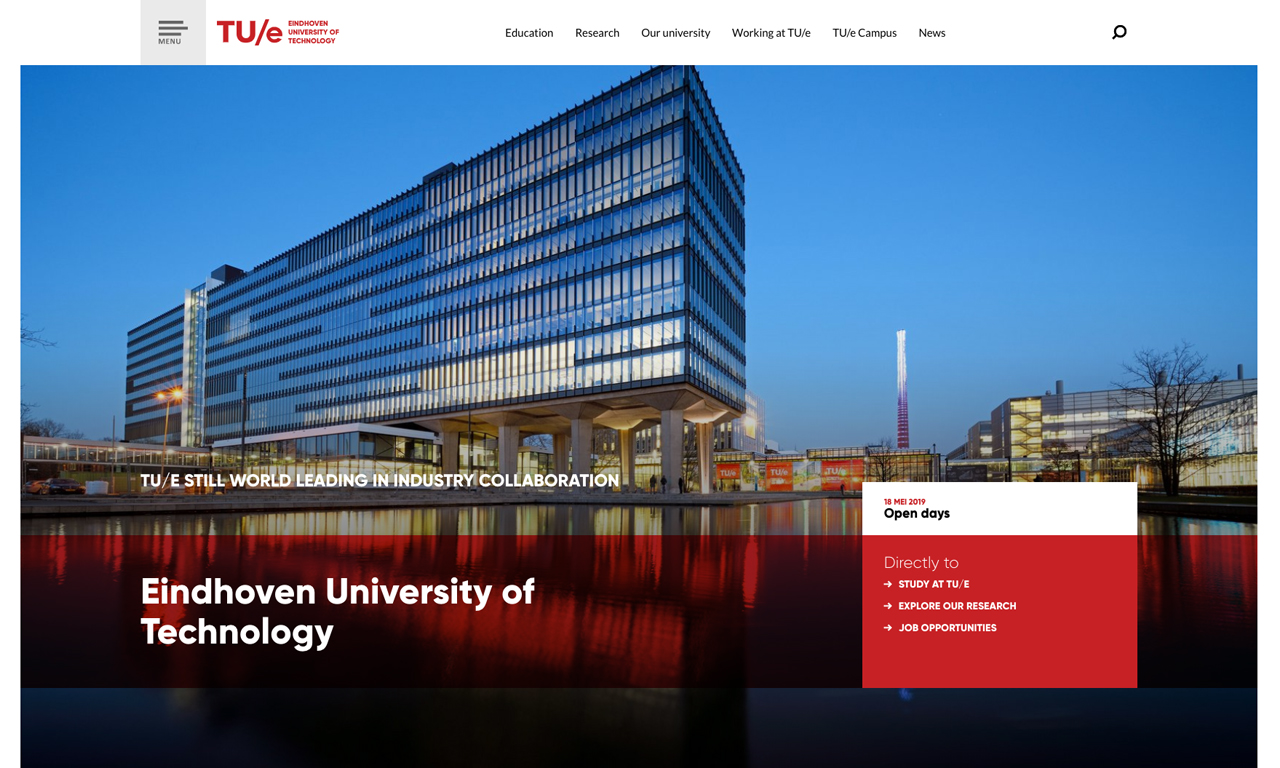
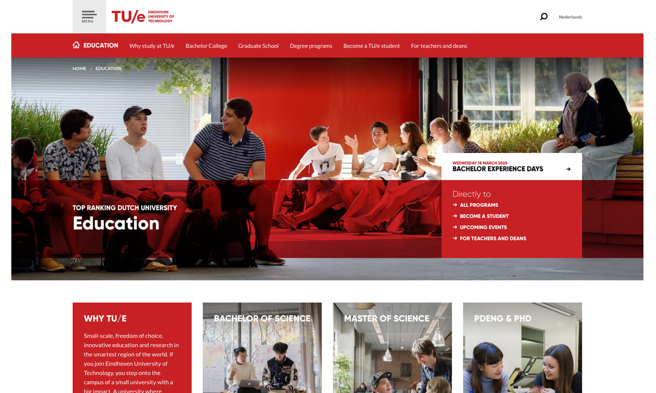
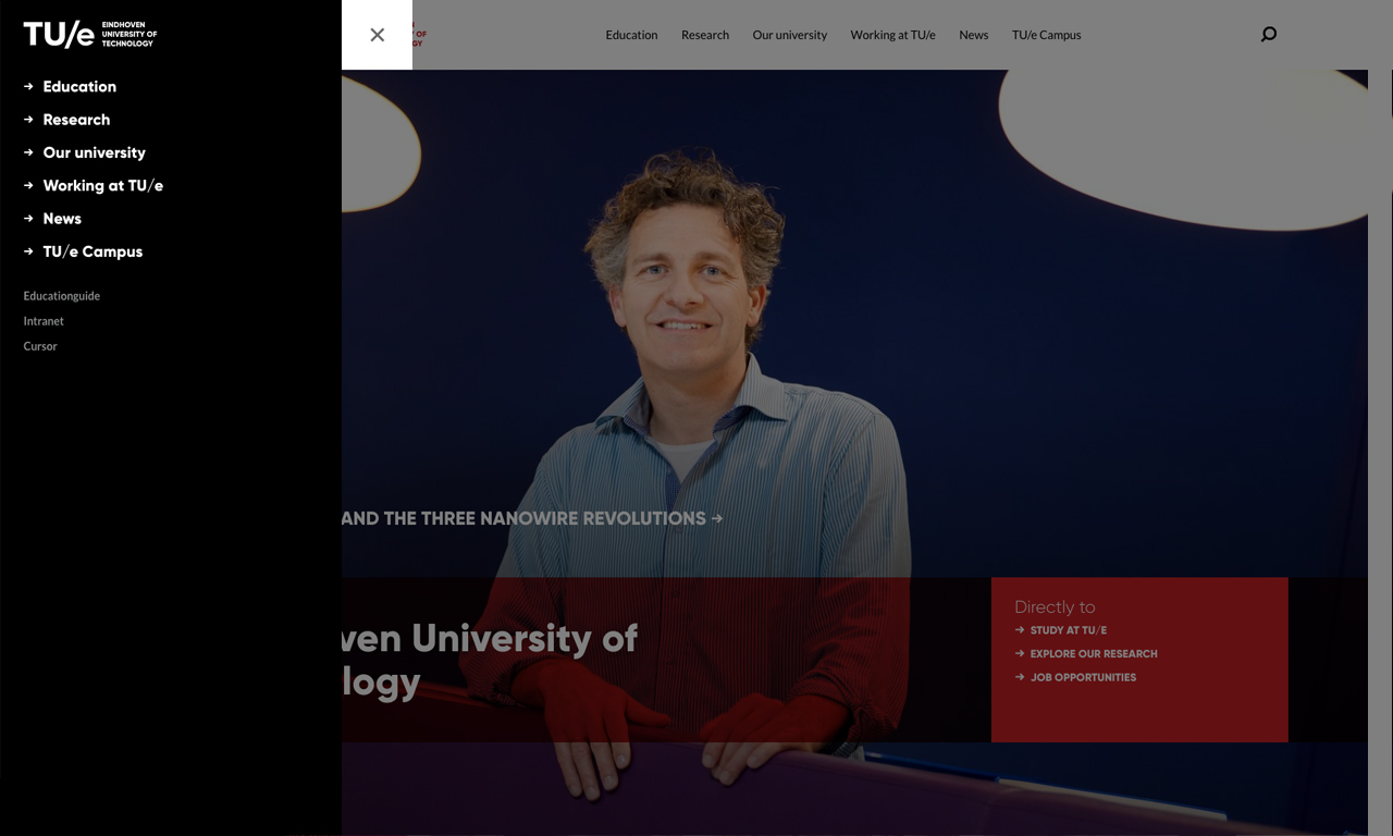
Worldwide university content platform
Educate students and advance knowledge in science & technology for the benefit of humanity. Eindhoven University of Technology is powered by TYPO3.

Redesign and restructure!
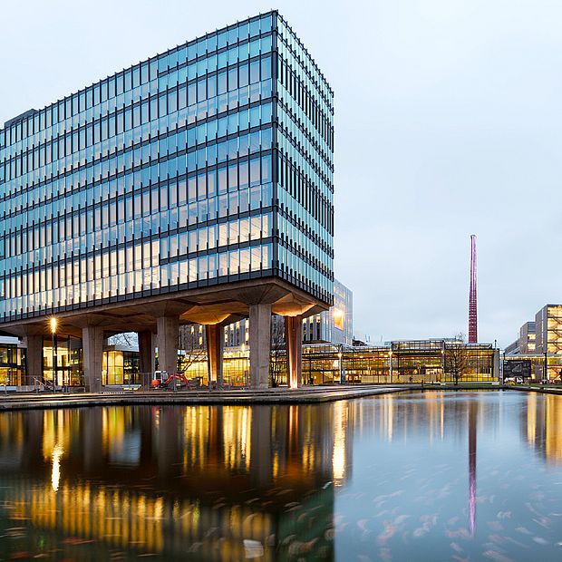
Eindhoven University of Technology (TU/e) is a top-ranking knowledge institute offering research-driven academic education. On the 75-hectare campus you will find more than 11,000 students, more than 3,000 employees and nearly 2,000 researchers.
COMPLEX EDUCATION ORGANIZATION
Educational organizations such as the TU/e are large and complex. The various faculties, research teams and support services ensure diversity. Online digital unity then requires a professional multisite solution, whereby not only the different TU/e platforms are linked to each other, but where the website also communicates well with the systems used by the various organisational units within the university. For students, think of Studielink or Osiris. But also the research systems of researchers, such as Pure by Elsevier for example.
LARGE DIVERSITY
As a large educational institution, TU/e has a diverse range of information, but also an enormous diversity in online target groups, such as students, students, companies, scientists and partner organisations. A well-developed content strategy ensures that all these website visitors can easily find their way to answer their questions.

Migration and rebuild to CMS 8 LTS
A website where visitors do not search for their information, but actually find it. Easily.
The TU/e website offers a large amount of information for different target groups. A well-arranged, flat structure is essential if you do not want visitors to get lost. Finding the requested information in 3 clicks was one of the questions from TU/e to MaxServ.
With the aim of serving their visitors well and relieving their own support desk. Unity in the site was also an important wish to improve overall branding. The decentralised organisation of the web editors stood in the way of this. Finally, the university wanted more attention for research online. Findable relevant research information for scientific peers, financiers and potential employees, among others.
The result
A multi-site platform that TU/e is proud of and that leads visitors to the answer to their questions in just 3 clicks.
STRATEGY
In close cooperation with TU/e we have established a strong online strategy.
- A new platform that communicates effortlessly with education systems. This allows researchers to transfer the research information they have selected directly to the website. And students simply register for a course.
- A central and compact web editor, for clarity and manageability.
- A roadmap for the coming years: TU/e will not be faced with digital surprises and can prepare well for the steps to come.
TECHNIC
TU/e has a platform that has been fully screened by us and whose code we have fully prepared and documented technically. The release processes are now controlled because we work with a well-designed OTAP street. That stands for Development Test Acceptance and Production. The hosting that we have taken care of provides a stable, reliable platform. In short, a fast, secure website, without worries.
CONTENT
Together with TU/e, we have determined a masterful content strategy for each pillar (education and research). Every visitor finds what they are looking for in a few clicks. For example, students receive a tailor-made roadmap with the personal steps they have to follow. The new, professional design that we developed for the university also determines the strong positioning of the TU/e.
TYPO3 supports a wide variety of projects across industries. Interested in transforming your organization's digital presence?
