Guide to the Content Editing Experience in TYPO3 CMS
TYPO3 has an intuitive editor-friendly user experience. In this broad overview, we’ll look at the content editing experience through the content editing workflow, from content creation to maintenance. In Part 1, we’ll look at how content editors build rich pages in multiple languages.
We’ll hear tips and advice from a marketing expert, Luisa Faßbender, with ideas on improving the content editing experience even further through configuration and extensions. Luisa Faßbender is working as a project manager at Marketing Factory Consulting GmbH, and has been working with TYPO3 since 2015. She helps customers scope and plan TYPO3 websites and is the first point of support for them. Additionally, Luisa volunteers as the lead of the TYPO3 Marketing Team.
It just works: the out-of-the-box experience with core and popular extensions
When you look at the TYPO3 editing experience, it’s amazing how much just works with core and popular extensions.Functionality provided by TYPO3 core is constantly evolving with each version. TYPO3’s possibilities, with only a handful of popular extensions, are pretty impressive. No custom code needed!
Onboarding new content editors
From the start, it’s always been easy for teams to onboard new content editors in TYPO3.
Luisa said, in her opinion, the TYPO3 backend is easy to use in all cases. “Creating and managing content in TYPO3 is effortless and doesn’t require special training or demos. You can pretty much onboard yourself quickly by simply playing around. Almost every function includes some kind of icon, which helps people understand what they are able to do when pressing a certain button.”
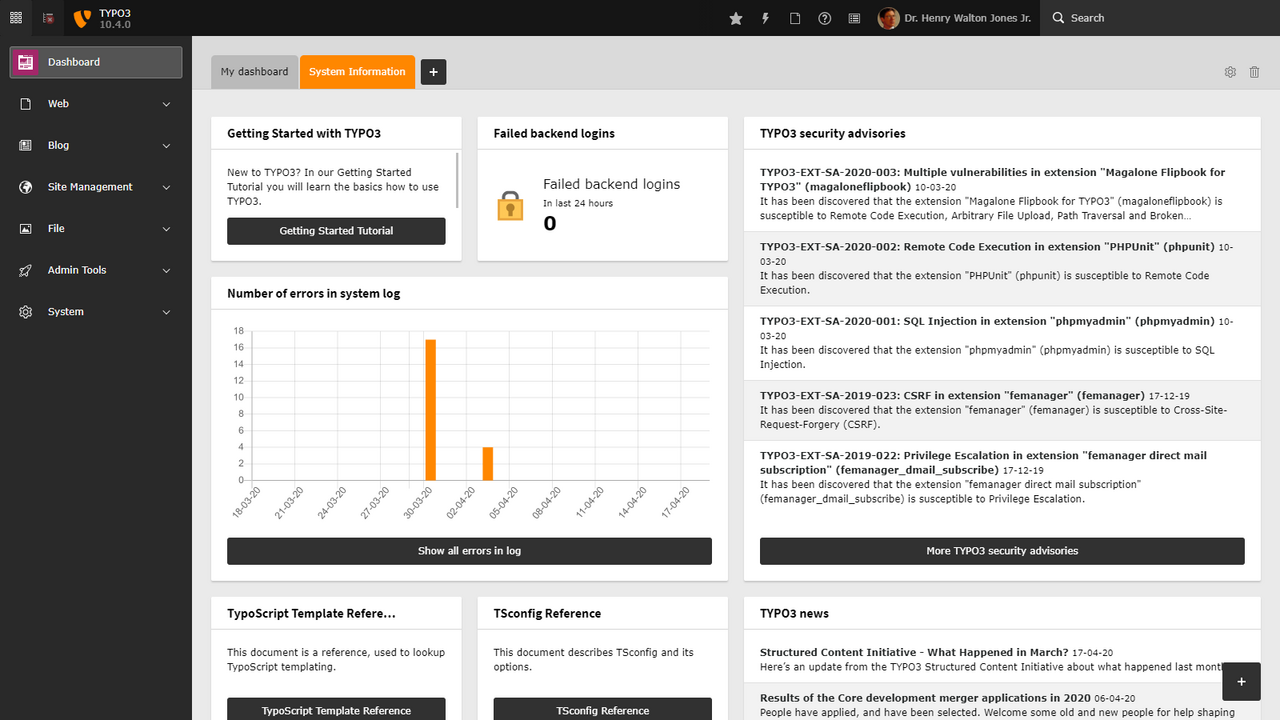
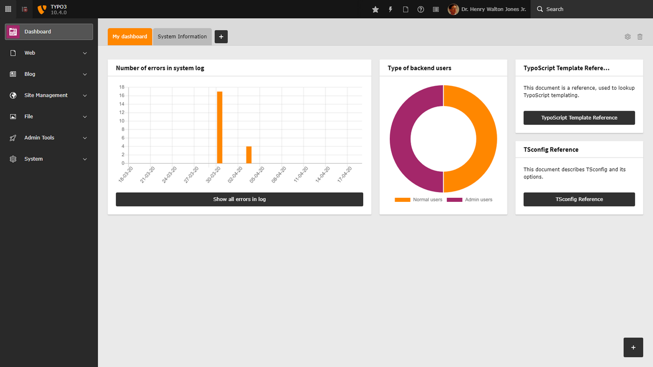
Integrators can create friendly experiences with customized dashboards editors see as soon as they login. With the new Dashboard in TYPO3 v10, you can also set up quick links to help editors get their work done, and see what is happening across the site.
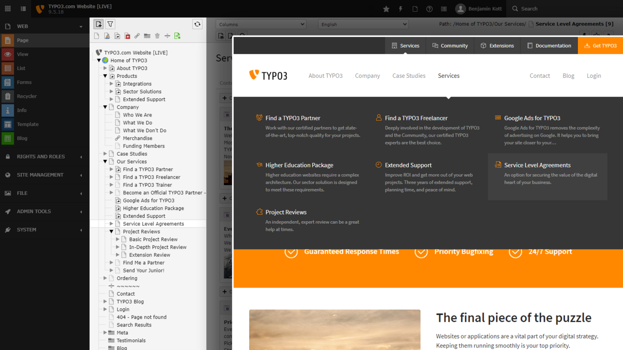
Browsing content in the page tree is intuitive, familiar, and friendly. Luisa said “I’m personally just a fan of how easy and structured TYPO3’s backend is. It is really intuitive to use, you can easily manage both – pages and content elements – with a variety of already known UI tools, like drag & drop for example.”
It’s natural for users to think of content in a hierarchical way, for example to add a new child page within a ‘section’ of a site, and move it around.
The page tree context menu allows quick access to editing tools. This is a small detail, but it just works the way users expect it to, there’s no mystery.
The page tree also represents your installation’s hierarchical structure. With it, you can directly control menu placement without having to manage these in another user interface. Of course these can be overridden to hide certain pages from a menu, or make content appear in multiple places.
Navigating and finding what you need is easy. Luisa said “If you’re looking for content in the backend, and you don’t know in which section of the website it is, you can easily navigate to the correct section by relying on the frontend navigation structure. The backend and frontend navigation is usually almost similar in terms of structure. Or you can use the really helpful search feature, which will narrow down the results for you.”
Page types and layouts
When editors add a new page in the page tree they can specify which page type it is. That will control what settings and fields are available in the page editing form and the default settings. Editors can also apply layouts to the pages, and that controls what regions are available. In the Appearance tab, they can see a schematic of what the layouts look like. These choices are made at the outset when the site is designed and developed.
Designers are in full control of how things appear, and content editors can express themselves fully and safely within the toolbox of modular elements their designer gives them.
TYPO3 content elements
In TYPO3, pages are assembled by adding modular elements that control how content is input (what fields they see in the form) and how it’s displayed.
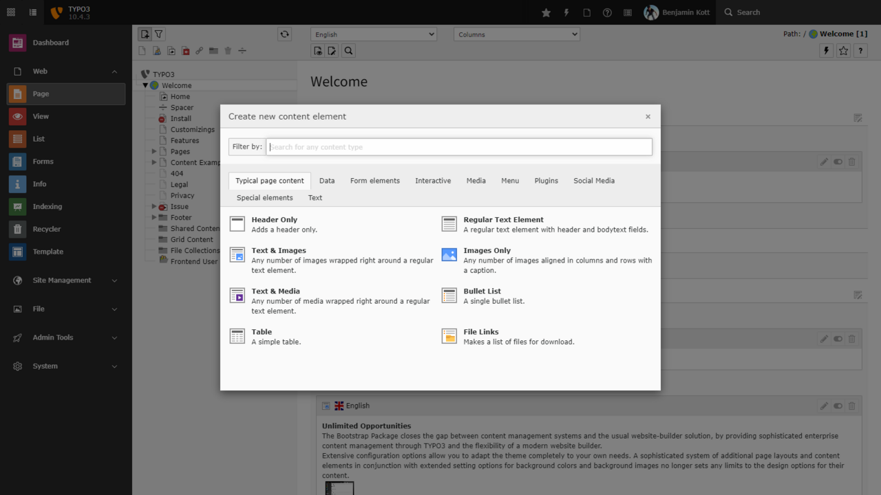
You can control and customize the elements available on your sites. To add content elements to a page, editors can browse among the tabs in the UI, and in the latest version, they can type ahead to filter which elements are available. Here is an example.
Here are a few examples of the types of elements that make up a page:
- An image gallery
- A table of contents
- Form elements
- Menu elements like a list of “recently updated” content.
As editors add content elements to a page, the template and positions are reflected in the backend UI. Editors can move content elements around from place to place, giving them a quick visual idea of how the content will appear.
This kind of page-assembly gives editors the ability to create content flexibility within a predefined design.
TYPO3’s easy media management
It’s easy to add images and media to content in TYPO3, and even reuse images and media across your site.
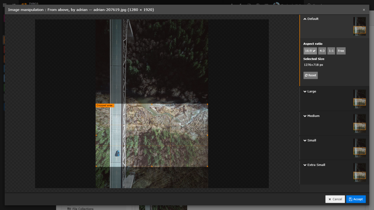
Editors can choose a content element, for example “Text & media,” which allows for image upload and management. Luisa said “Especially when it comes to integrating media into your content elements, TYPO3 shines. I’m a big, big fan of the image positioning possibilities. This actually makes the finished text-media content element appear as you would expect them to and it doesn’t break your entire layout. Also, I enjoy using the image editor, which lets you crop, resize, and add focal points to your images.”
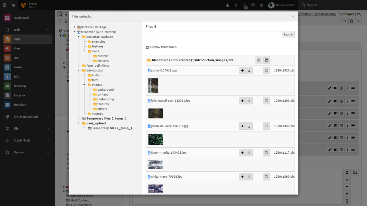
They can use the File selector to reuse an image that is already uploaded. Luisa said “It’s easy to find content in the file list. You do not need to know in which folder a document or image was placed. You can use the search function in the file list.”
Read working with images.
Creating forms
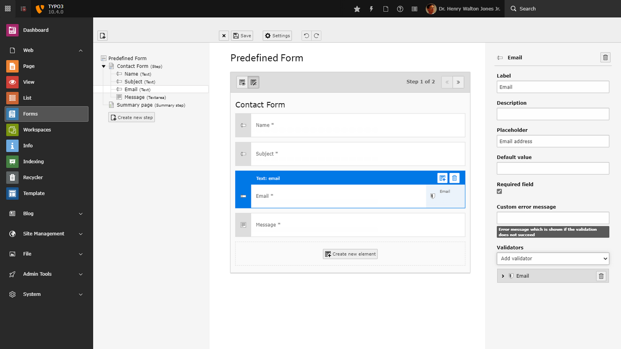
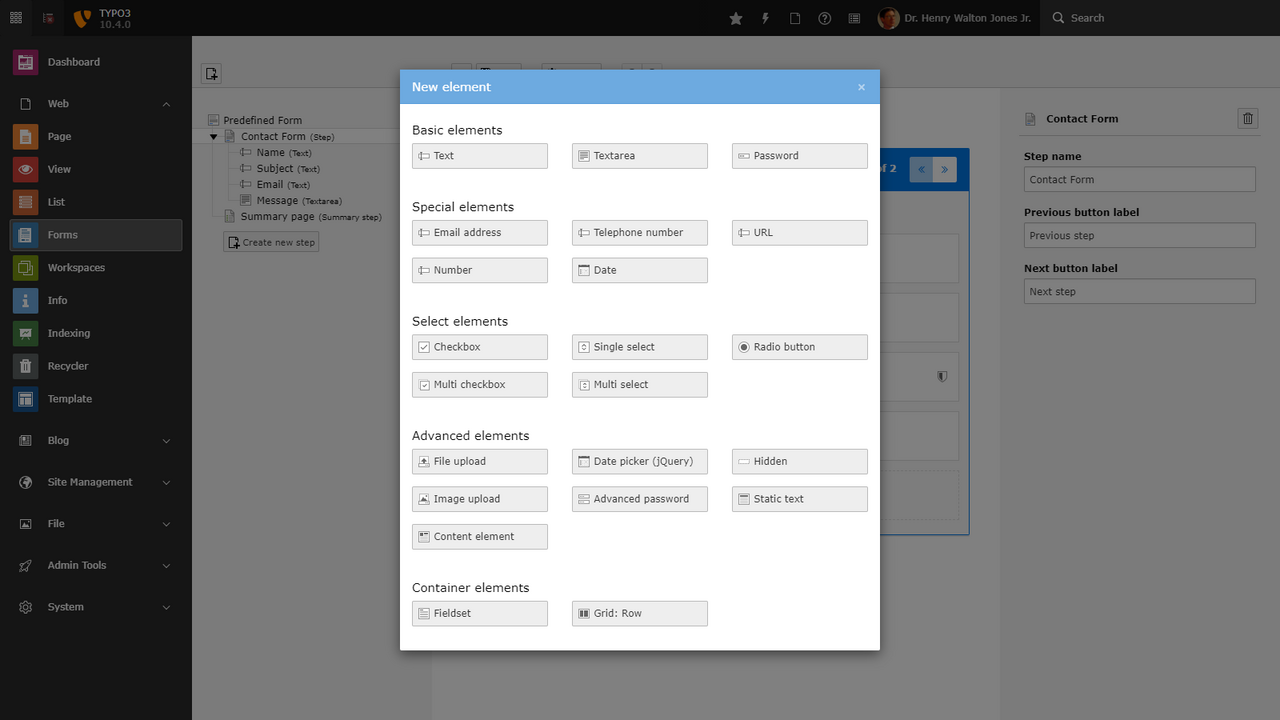
Another one of the content elements you can add to a page is a form element that you can place anywhere on your site. For example, creating a contact form is easy in TYPO3, you don’t need to know any code. Content editors can add form elements, and drag and drop them. Here we see some example elements to create forms.
In the most recent version of TYPO3, the form editor was improved. Now editors can also specify multiple recipients and even CC and BCC who should get the results of the form.
Multilingual out-of-the-box
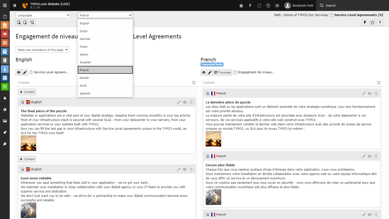
TYPO3 supports multilingual websites and content translation without needing any third-party extensions. The user interface is intuitive and best-in-class for multilingual content editing and includes helpful features like notification for translators when original content is updated and translations need a fresh review. TYPO3 provides entry points for translation service providers like LanguageWire. It’s an open system that’s easy to extend in all directions.
From the editors perspective, they can login and use TYPO3 in their own language. TYPO3’s admin interface is already translated into many languages. When it comes time to translate any new extensions, TYPO3 now uses Crowdin to create and manage translations. Editing also supports non-Latin character sets—Arabic, Chinese, Cyrillic, etc., and even quoting right-to-left text within left-to-right text.
In Part 2, we’ll look at how to manage content, preview, bulk manage, and ensure quality right out of the box. To be continued!

