Best Practices: Style Guide Driven Development With TYPO3
Thanks to Tracy from OSP for sharing!
TYPO3 CMS is a proven, enterprise-grade, open-source CMS platform. But even with the best system at your disposal, without a fully fleshed-out set of website design best practices, it’s hard to create a consistent and user-friendly design and experience. One answer to this problem is style guide driven development (SGDD).
Below, we’ll examine a few SGDD basics and discuss some ways it can benefit your development team and your users.
This article was created with contributions from Gerrit Sturm, Piotr Zarycinski, and Jörg Ems.
What is style guide driven development?
Style guide driven development starts from a consistent, dynamic style guide built right into the front end of your website from the earliest stages of development. The living style guide is a prototype that shows how user interface (UI) components will appear throughout the website or web application. When you change elements in the style guide, the rest of your site changes with it. As you develop more of your site, you can iterate on both style and functionality at the same time without any disconnection.
Most designers and user experience (UX) professionals start backward: They begin prototyping a website, and then attempt to apply a style guide to it from a PDF or Photoshop design sometime after development has begun. This can make maintaining consistency and a visual style quite difficult. Making things worse is that when changes are made to the static, external style guide, developers have to stop work on new features and improvements to manually change and fix the website’s user interface, look, and feel.
Style guide driven development turns this “traditional” approach to website design on its head. You begin by building styles and UI elements into a live style guide (LSG) as part of your website. The live style guide includes and shows all of your potential design options, interface elements, combinations, and possibilities of your UI, including:
Text treatments such as fonts and colors
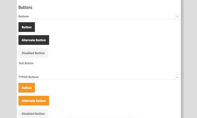
Interactive elements such as buttons and forms
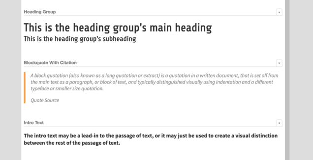
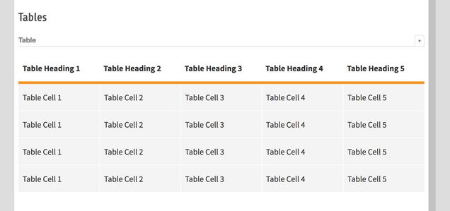
Semantic elements such as headers, lists, tables, blockquotes
Media elements such as images
The style guide is already built into your website. As development continues, your needs and style considerations might lead you to change something. Changing something in the style guide changes that element everywhere on the site.

Want to learn more? Check out style guide driven development tutorials.
Why is style guide driven development valuable?
Style guide driven development helps designers and developers maintain consistency–even throughout multiple iterations, across sites, and across different development teams. This methodology also leads to delivering more satisfying user experiences, while saving time and effort. Win-win!
Inconsistency of design elements in applications and sites presents not only an inferior user experience, but also create difficult bugs that can be hard to track down. When designer Nicole Sullivan introduced style guide driven development to her projects, she said “We had 20 to 30 different kinds of buttons with different sizes. You couldn’t always see that they were different, they would look like the same kind of orange button, but there would be a pixel of difference.” This also made updating and making changes frustrating and difficult.
By separating the CMS business logic and data layers from the display layer, you can make as many changes to the look and feel of the website as you like, without breaking any fundamental functionality or compatibility with other systems.

How to get started with style guide driven development
The first step to getting started with this approach is to discover the user interface elements in your website or web application. Next, abstract them into reusable components and document them. Then you can refer back to your living style guide to implement them in new features.
We recommend starting with a tool called Pattern Lab. It is built on so-called “atomic design” principles. It starts with the smallest user interface components, referred to as atoms. Atoms are put together to form “molecules”, these in turn are combined into larger and larger meta objects called “organisms,” “templates” and “pages” in Pattern Lab terminology.
The atoms, being the smallest components of your UI, could be your choice of fonts, colors, and shapes. These three are combined when you design molecules like buttons, error messages, or paragraphs. Combinations of molecules are then put together to form more complex UI elements like an article teaser which would combine an image style, text treatment, and a “read more” button.
Have a look at the Pattern Lab for TYPO3.com for an example of how all this can come together to form a cohesive design language.

Using Pattern Lab, you can begin creating smart, responsive content elements and meta objects that can be combined, iterated on, and improved in a consistent way. If you change an atom like a base color, it changes everywhere in your design and your site. If you redesign a molecule, that change is immediately reflected anywhere that molecule is used, whether on its own or in larger meta-objects. The Pattern Lab helps you maintain consistency across development cycles, making it a perfect SGDD choice.
Curious about alternatives? Check out this overview of live style guide generators.
Streamline the development cycle with style guide driven development
With a little bit of pre-planning, and the use of the proper tools and best practices, it’s easy to develop TYPO3 CMS websites using style guide driven development to deliver fantastic design and user experiences.
We’ll be happy to help you find a qualified and officially certified development partner who can help you execute a style guide driven development strategy for your next web project.