10 Admin UX Improvements in TYPO3 v10
TYPO3 CMS has long had great UX for editors and admins in the backend. Here are 10 great admin/editor UX features in coming your way in TYPO3 CMS v10.
TYPO3 v10.3 has just come out, this feature freeze phase is the best time to download and try it out. Your feedback will make it the best version of TYPO3 CMS yet. Mark your calendars for 21 April for the release of TYPO3 v10 LTS.
Time to upgrade or try TYPO3 CMS for the first time? We can help you with a Project Review.
What makes a great CMS user experience?
Great user experience in TYPO3 comes from the out-of-the-box capabilities, but it also relies on how well the site and custom extensions have been set up for ease-of-use.
From the start, integrators click through UIs for site-wide configuration, multilingual setup, secure access control, workspaces, and all the internals that are managed in the admin area. And every day, content editors navigate the admin area, create new content, and manage files.
When we talk about user experience—it’s partly the out-of-the-box UI that TYPO3 offers and partly how their site has been set up. It’s up to the integrators and developers to set up the site to make it easy to use for content editors.
So let’s look at some improvements coming in TYPO3 v10 on 21 April 2020!
1. The TYPO3 Dashboard Module
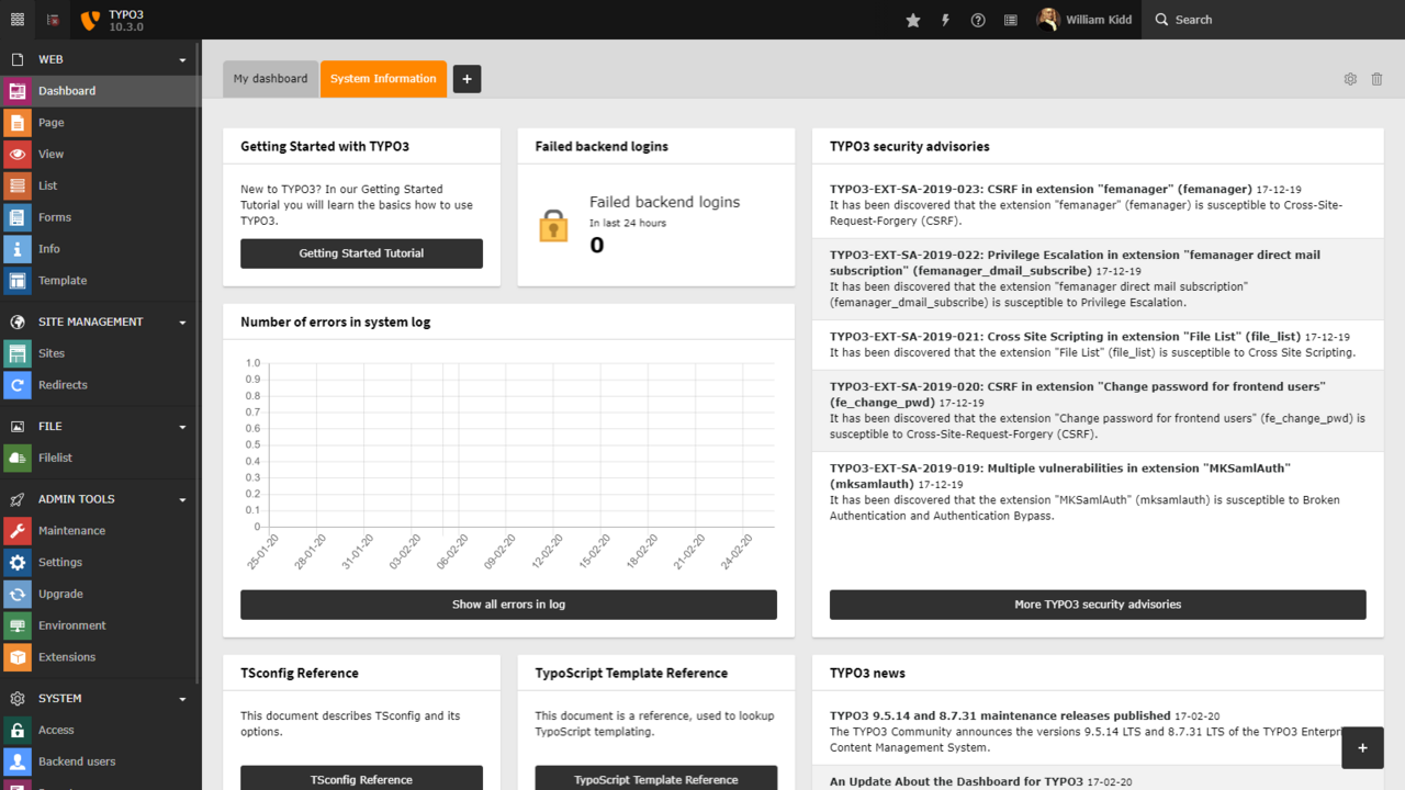
Getting in just before feature freeze, the Dashboard module offers a great starting point in the admin area for TYPO3. This includes a dashboard module in the backend, the API to create your own widgets, and some simple widgets. Read more here: An Update About the Dashboard for TYPO3, by Richard Haeser.
2. Better accessibility with TYPO3 page tree keyboard navigation
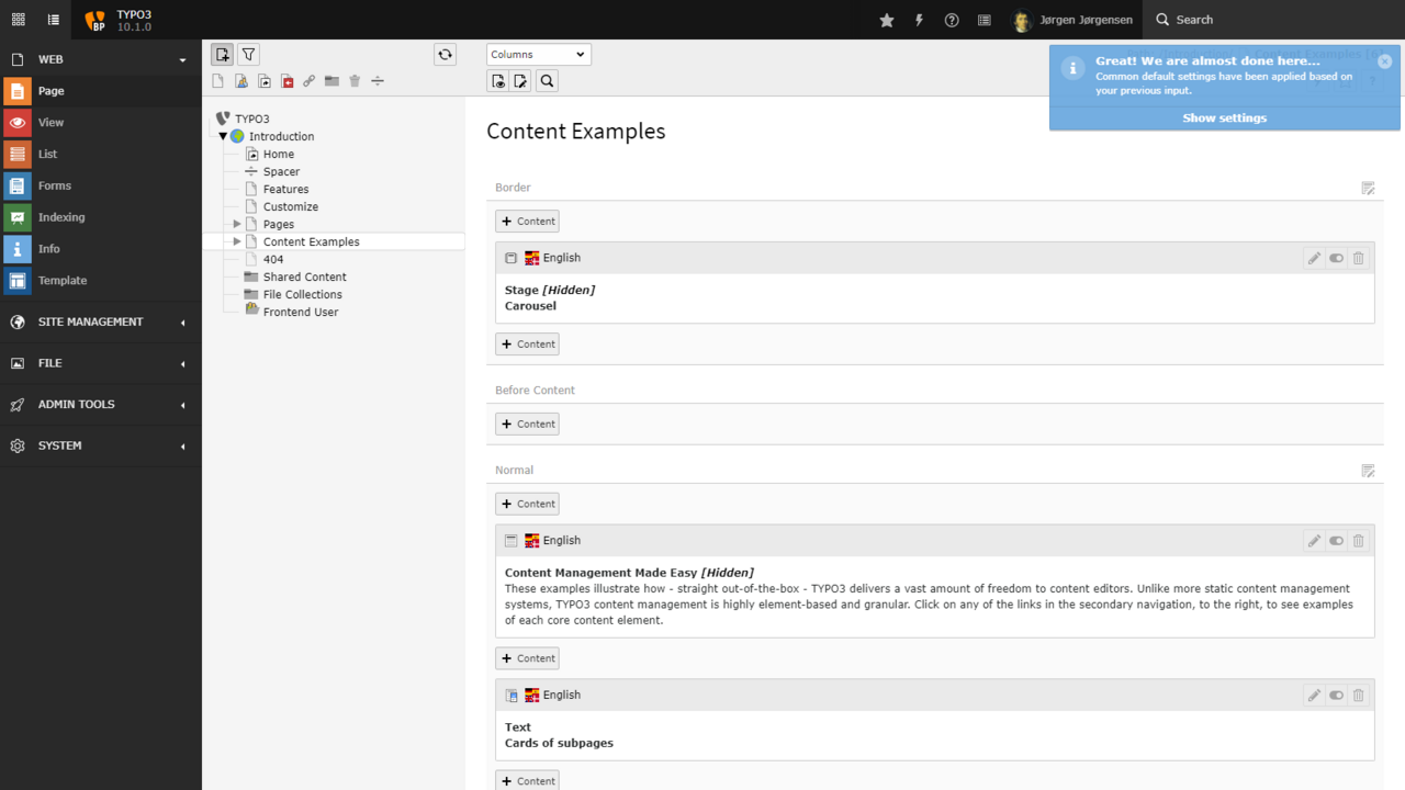
The TYPO3 page tree is a much-loved interface that makes site and content management intuitive. TYPO3 v10 introduces keyboard navigation which is a major accessibility improvement.
TYPO3’s digital asset management is great for managing thousands of digital assets. Now you can sort on any aspect including metadata and file titles manage numbers amounts of files more easily.
4. Changing a URL? Now the URL segment auto-updates and redirects
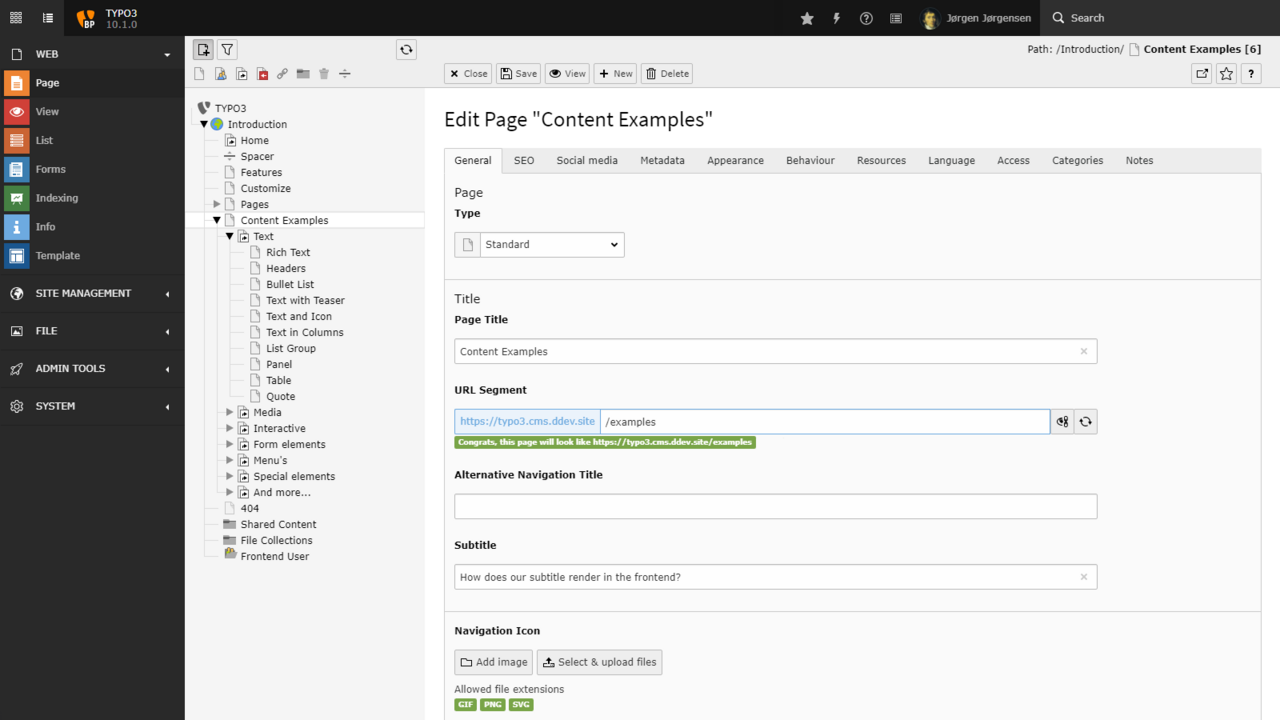
Extending on the improvements for human-readable URLs in v9, now when you update a URL segment, it will automatically update URL segments of subpages and create redirects from all old URLs to the new URLs. Both the update and redirect creation are easily revertable by the editor. This ensures end users don’t end up on dead links.
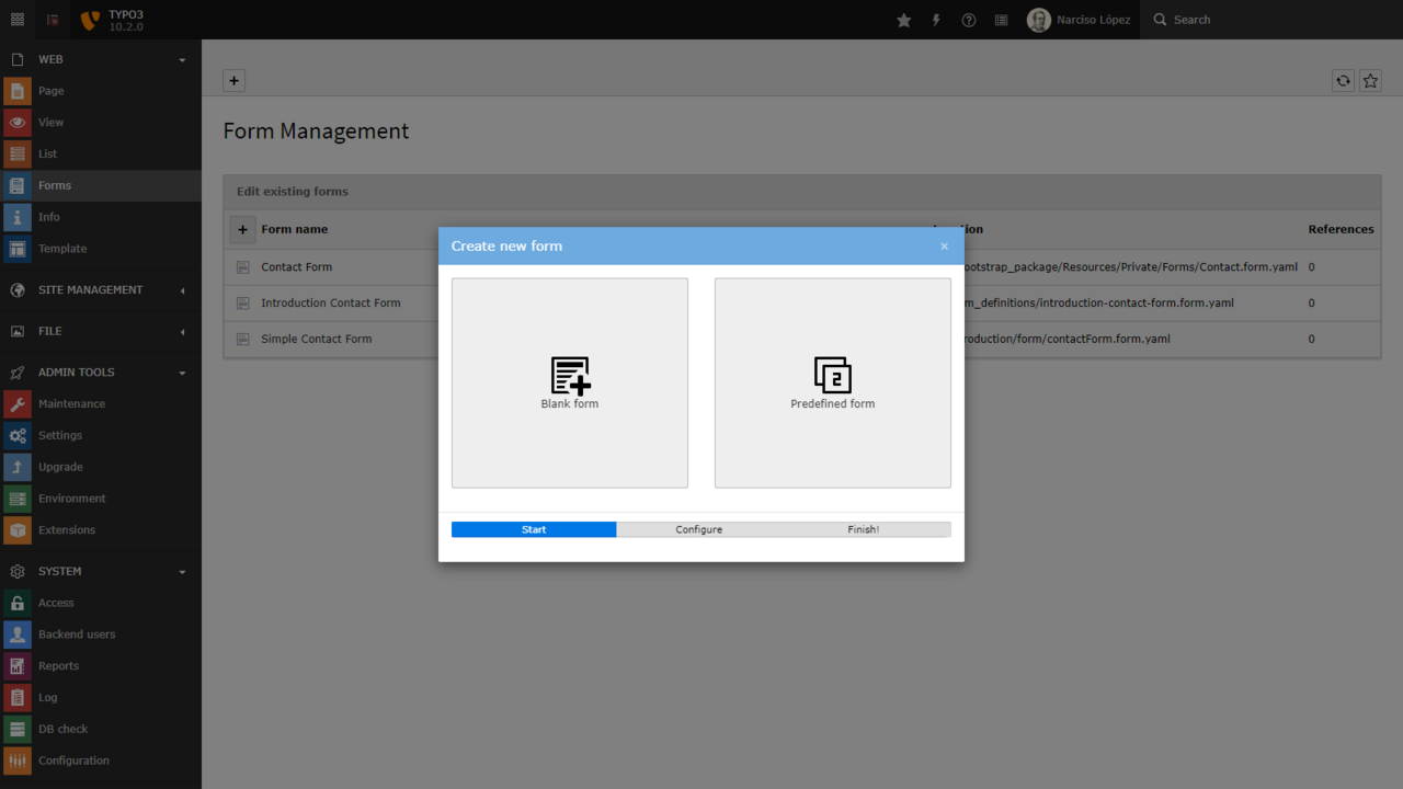
When you’re editing forms, you can click to edit form elements directly. And when managing forms you can sort and browse to find what you need quickly.
7. No dead ends—validate external links
Now content editors can validate external links as they add them—also in the rich text editor. This small detail ensures a better end-user experience with no dead links.
9. Links to documentation in Extension Manager
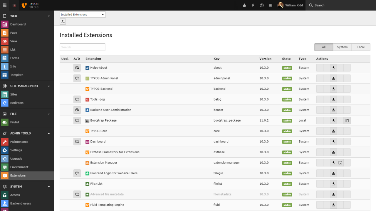
TYPO3 v9’s Extension Scanner introduced documentation at your fingers to make upgrades easier. Now in v10, the Extension Manager includes links to extension documentation.
The TYPO3 CMS user experience includes initial site configuration, site maintenance, and content creation. These are just a few of the features which have seen user experience improvements in TYPO3 v10.
Survey: Content editing UX in TYPO3
Want to get involved in improving the content editing UX in TYPO3?
The Structured Content Initiative is currently conducting a survey about the most common use cases when creating content with TYPO3, in order to optimize the corresponding user experience. Check out News from the Structured Content Initiative, by Rachel Foucard.
Share this TYPO3 UX survey with colleagues and clients so they can get the best possible picture of user experience in TYPO3.
Build a great UX with TYPO3
What makes a great user experience in TYPO3? It’s a mix of the out-of-the-box UI and the capabilities for integrators and developers to make customized experiences with site configuration and custom extensions.
A great CMS user experience means both the backends site management UX and content editing UX: from site creation and management to everyday content management. An easy to use CMS ensures sites are more secure, performant, better tuned for SEO, and, in turn, offer a better user experience to visitors. It’s win-win-win.
If you’d like us to look at your TYPO3 projects and give you feedback that will improve your sites, we can give you a thorough review and prepare you for the next version of TYPO3.
