SkillDisplay - UX/UI Design: From Idea to Implementation

Thanks to Christina from SkillDisplay for sharing!
We are currently implementing our new profile view on the SkillDisplay platform and wanted to share some tips and tricks on how to improve the UX/UI design of your website.
Therefore, covered topics in this blog post include:
Your idea in words
Visual hierarchy
Finding the right UI layout design
User Flow
Screen Designs
Implementation
Your idea in words
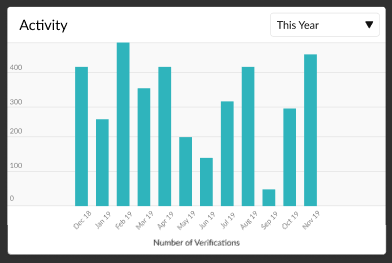
Write down the purpose of the site you want to create. Our goal is to redesign the user’s profile, including SkillPoints, awards, memberships, activity charts, and verifications. During the design process, some parts might change, so make sure to document those updates. Read on to see a closer description example for the awards section of the SkillDisplay user profile.
Awards
Awards will be available in the future. Verified/certified awards explain how versed you are in certain fields of expertise. They are tied to brands and the skills those brand owners created. The value measured is the percentage of skills you have verified/certified from all skills which are available on the platform from this brand.
The available awards are:
- Bronze (>25 %),
- Silver (>50 %),
- Gold (>75 %) and
- Diamond (>95 %)
The available titles are:
- Learner (Self-Verification)
- Student (Educational-Verification)
- Artisan (Business-Verification)
- Certified (Certification)
Visual hierarchy
The next part is to think about how you want to layout the data you want to visualize. There are a couple of things to consider when planning how to organise the content on your website. To list some of them:
- Size: UI elements that are bigger demand more attention.
- Colour: Colours can function as both a personal tool as well as an organisational tool.
- Contrast: Changing from a dark background to a light one can separate different parts of the content, like the main content to the footer.
- Proximity and spacing: Placing related elements close together suggests to readers that they are related. On the other hand, spacing can be used to separate elements.
- Whitespace and negative space: Adding space around grouped elements singles them out as separate groups of information. It can be used as space around elements and paragraphs or even space between lines of a paragraph.
- Further tools include alignment, repetition, the Golden Ratio, texture, and randomness.
Finding the right UI layout design
Different patterns can be used to create a UI design. This section draws attention to cards, grids, carousels, and navigation tabs. There are also designs like breadcrumbs or progressive disclosure. If necessary, buttons, forms, lists, panels, and progress bars can be used. Always consider “form follows function” to keep the website as simple as possible and not overload it with unnecessary elements.
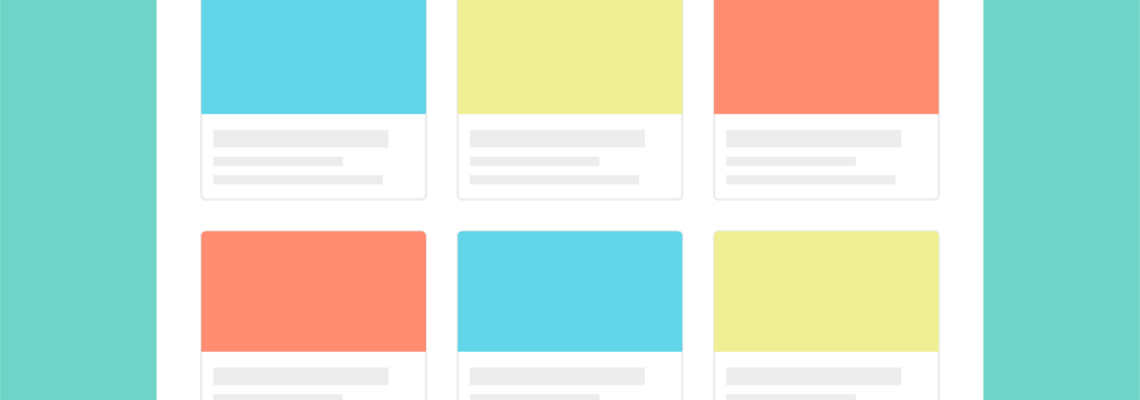
Cards
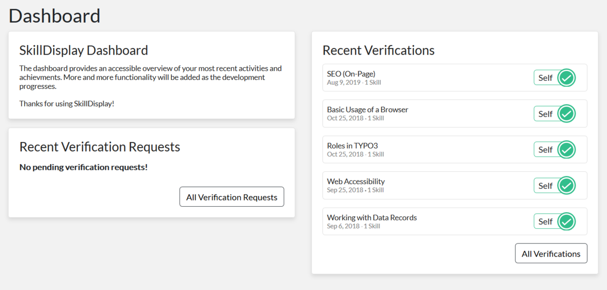
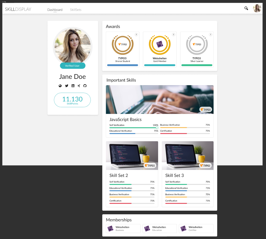
The SkillDisplay platform uses a layout tool that has been commonly used in recent years: cards. Cards visualise a combination of images and text. There are different scenarios where cards are useful and include interaction, variety of content length or visualising different content that has no relation with each other, like in the user dashboard:
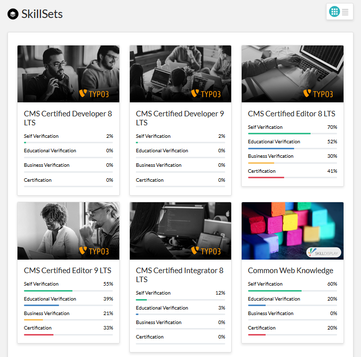
Grids
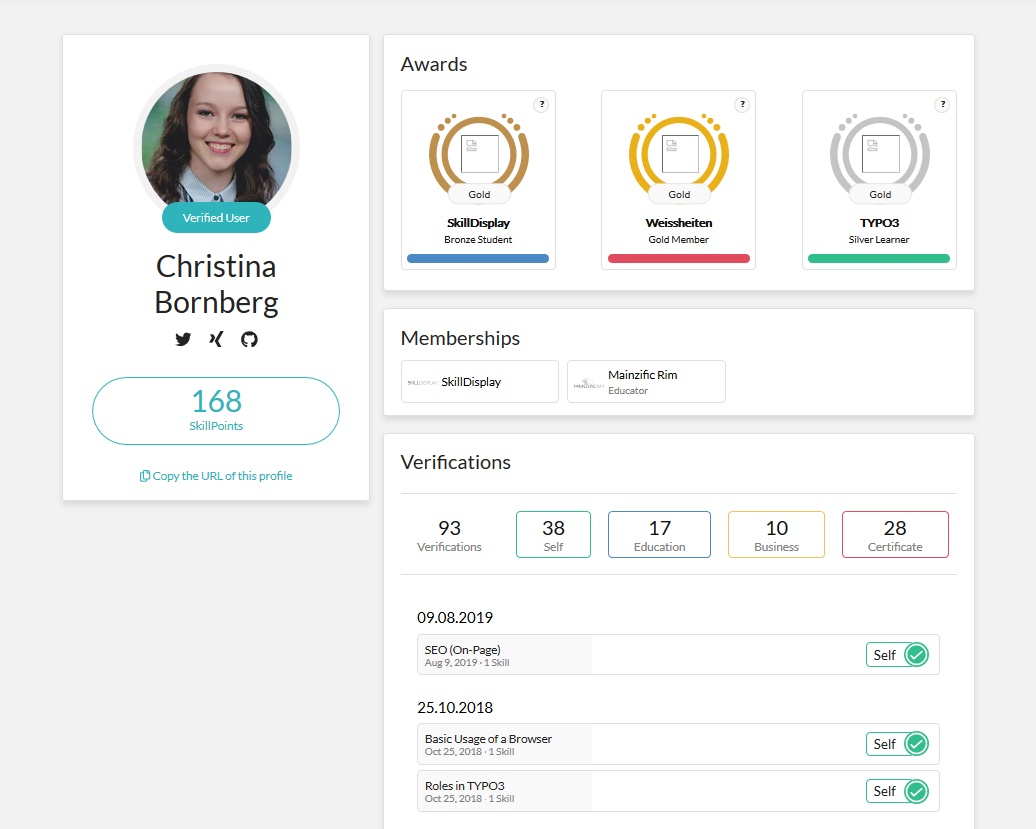
Grids are used to achieve consistency. No element is standing out more than the others and ties the content into a rational composition. To switch between certain layouts, a grid icon can be used like the turquoise one in the upper right corner of the following screenshot. The example shows the SkillDisplay platform’s SkillSet overview:
Carousels
Carousels are usually at the top of the homepage. They might consist of promotions, featured information or the website’s mission. Usually, images are used to draw even more attention to this layout element.
Navigation tabs
Navigation tabs are another way of laying out your website. Tabs are a good solution to separate different sections or categories. They can be used if there is limited visual space.
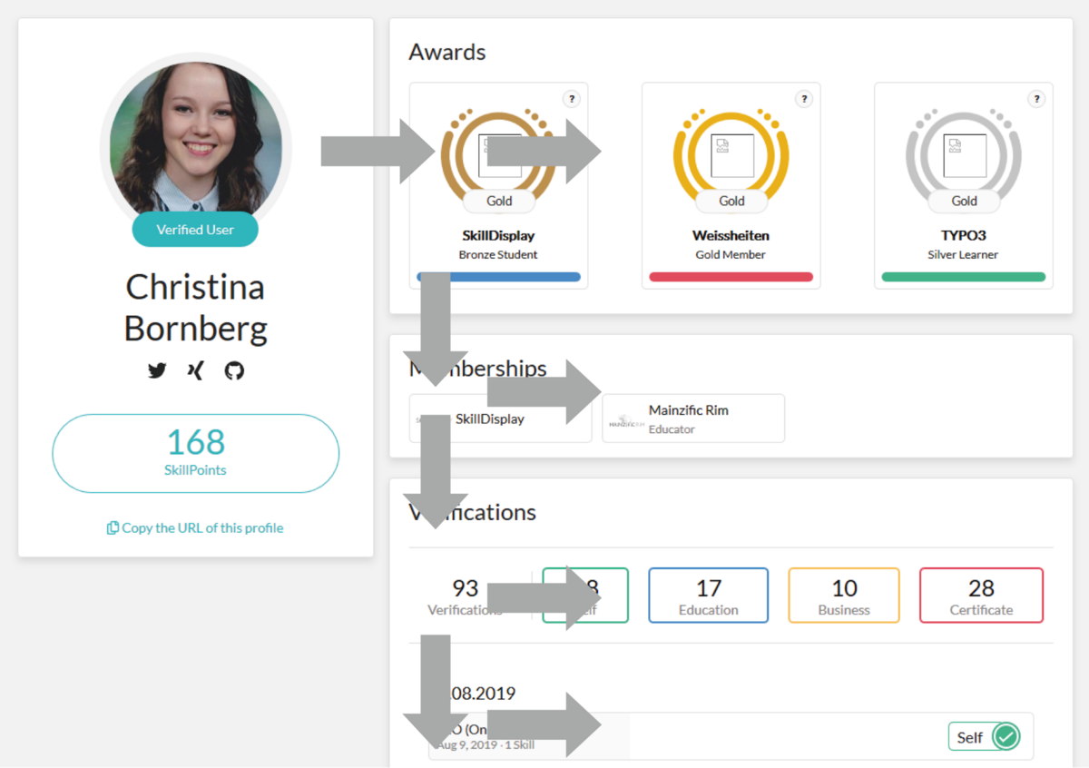
User Flow
The designer of a website should always think about how to direct the user to the right place. The focus should be centralised and in a reproducible order. To centralise a user’s focus for example, white spaces can be used. There are two common patterns: the Z-pattern and the F-pattern which are further described in Geveos blogpost about UX enhancing design layouts (The Z-pattern and the F-pattern). SkillDisplay’s user profile flow uses the concept of the F-pattern:
Screen Designs
For creating screen designs, different tools can be used. We were using Figma for the laying out and prototyping and a colour scheme designer for choosing our colours. Make sure the colours are suitable for people who have difficulties with low contrast. Use a tool like WebAIM to figure out the contrast ratio. Here are some of our latest screen designs created with Figma. Don’t forget to consider all sizes of displays, from phones to tablets to desktop PCs.
Implementation
Our implementation is in progress and you are able to see the current version of your own profile when logged in here: preview your public profile. Please be aware that the Awards function is not finished yet and we will add more sections to it in the following weeks.
Some skills of the Integrator and Developer SkillSets of the platform are helpful for you if you are planning on creating or changing your UI/UX design. Here are two recommendations:
Templates, Layouts, Partials
This skill is part of the TYPO3 CMS Certified Integrator (TCCI) and TYPO3 CMS Certified Developer (TCCD). Learn about what Fluid Templates, Layouts, and Partials are and how they are connected here.
Image generation and manipulation with TypoScript
Learn about image creation, image manipulation, and integration of fonts with TypoScript. The skill is part of the TYPO3 CMS Certified Integrator (TCCI) and is available here.
If you are not registered yet, you can do so here, otherwise, log in, learn something new and verify your skills on the platform.

Comments

Good share on the topic.